Brand Logos
The Visioneering Studios logo system is one of the most recognizable elements of our brand. Consistent use of approved logos across every division reinforces brand recognition, strengthens our identity, and presents a unified Visioneering presence.
resources
Enviropop Logo Files
Download the complete Enviropop logo library for use across print, digital, environmental, and marketing materials. The folder includes approved logo variations, orientations, and file formats to support a range of applications.
Download Logos
Logo Design
Brand Colors
The primary colors Enviropop Magenta, Carbon Black, and White form the foundation of our identity. Use them intentionally to create a clear hierarchy between backgrounds, typography, and accent elements.
Copy HEX Code
Enviropop Magenta
CMYK
13, 100, 62, 2
RGB
207, 30, 79
HEX
#CE0B4C
PMS
7636 C
Copy HEX Code
Carbon Black
CMYK
73, 67, 65, 80
RGB
23, 23, 23
HEX
#171717
PMS
Black 6 C
Copy HEX Code
White
CMYK
0, 0, 0, 0
RGB
255, 255, 255
HEX
#FFFFFF
PMS
Pure White
50%
Carbon Black
30%
Enviropop Magenta
20%
White
Color Proportions
When pairing our logo with a partner’s, use three times the small inner square for spacing. Place a thin dividing line in the center to maintain visual balance.
Typography
Enviropop Font
Download and install the approved Enviropop typeface to keep typography consistent across all brand materials. This font should be used according to the hierarchy and styling outlined throughout the Enviropop brand guidelines.
Download Font
Our Typeface System
Enviropop uses DM Sans as its primary typeface across all brand communications. Inspired by Swiss design principles, the type system relies on scale, weight, spacing, and hierarchy rather than multiple typefaces to create distinction. Headlines, subheads, labels, and body copy are differentiated through intentional changes in size and weight, creating a clear, structured hierarchy while keeping the overall system clean, bold, and consistent.
Display/Hero - DM Sans Bold
Large statements, campaign headlines.
This is a Large Headline.
Headline - DM Sans Semibold
Primary page or section headlines.
This is Your Typical Headline.
Subheadline - DM Sans Medium
Supporting headlines, introductions and callouts.
Supporting information lives in your subheadline.
Body Copy - DM Sans Regular
Paragraphs and longer-form copy.
Body copy remains simple, clean, and highly legible, creating a comfortable reading experience while providing visual contrast against the larger, heavier typography used throughout the system. Its restrained scale and weight allow supporting information to feel organized and approachable without competing with headlines, helping maintain a clear hierarchy and consistent rhythm across every Enviropop application.
Logo Design
Brand Logomark
Our logomark represents the core of our identity, balance between our circular symbol and custom wordmark. Together, they form the complete expression of our brand. Always use the official lockup provided, and never alter proportions.
Logo Clearspace
Clearspace ensures our logo always appears with enough breathing room to maintain its visibility and impact. The minimum clearspace is defined by the height of our symbol (marked as X) and should surround the logo on all sides.
Logo Design
Color Formats
Our logos are available in four approved color treatments: Visioneering Blue, Dark Blue, Off Black, and White. To ensure maximum contrast, legibility, and brand consistency, use only the approved color combinations shown below.
Background
Logo Design
Minimum Sizes
For applications where the primary horizontal logo falls below the minimum size, use the stacked logo instead to preserve legibility.
Print 0.3 height
The logo must be at least 0.3 inches in height for print to ensure clarity and legibility. Smaller sizes may cause loss of detail and reduce brand impact.
Brand image 1
Digital 48px height
The logo must be at least 48 pixels in height on digital platforms to maintain clarity and legibility. Smaller sizes may affect visibility and recognition.
Brand image 2
Social Media
Avatar Displays
Avatar displays must use only the approved Enviropop ā€œeā€ icon treatments: magenta on white or white on magenta. No other color combinations or avatar variations are permitted unless approved by the Marketing team.
Image
Image
Social Media
Avatar Displays
Our brand occasionally collaborates with other organizations on shared initiatives and campaigns. When creating a joint lockup, maintain consistent spacing and alignment to ensure both identities appear balanced and cohesive.n
Partnership Lockup
When pairing the Enviropop logo with a partner logo, place the Enviropop logo to the left of the approved vertical divider and the partner logo to the right. Maintain clear space between each logo and the divider equal to half the width of the ā€œoā€ in the Enviropop logo
Application
Incorrect Usages
To maintain brand consistency and legibility, always use the logo in its approved form and color treatments. The examples below illustrate common misuses to avoid.
Brand image 1
Avoid Busy Backgrounds
Don't place the logo over cluttered or complex backgrounds like bookshelves, patterns, or detailed imagery. This reduces legibility and diminishes brand impact.

Brand image 1
No Effects or Alternate Fills
Do not apply gradients, shadows, or other visual effects to the logo. Always use the logo in its original artwork without enhancements or modifications.
Brand image 1
Preserve Color Integrity
The logo should appear only in its approved color treatments. Do not substitute, modify, or apply custom colors, as this compromises brand recognition and consistency.
Brand image 1
Do Not Stretch or Distort
Do not stretch, compress, or distort the logo in any direction. Always scale the logo proportionally to preserve its intended appearance and maintain brand consistency.
Brand image 1
Do Not Rotate or Reorient
The logo should always appear in its original orientation. Rotating, mirroring, or flipping the logo is not permitted.
Brand image 1
Incorrect Tagline
Do not create or add custom taglines, descriptors, or messaging to the Enviropop logo. Only approved logo configurations and brand messaging should be used.
Graphic Assets
Enviropop Graphic Assets
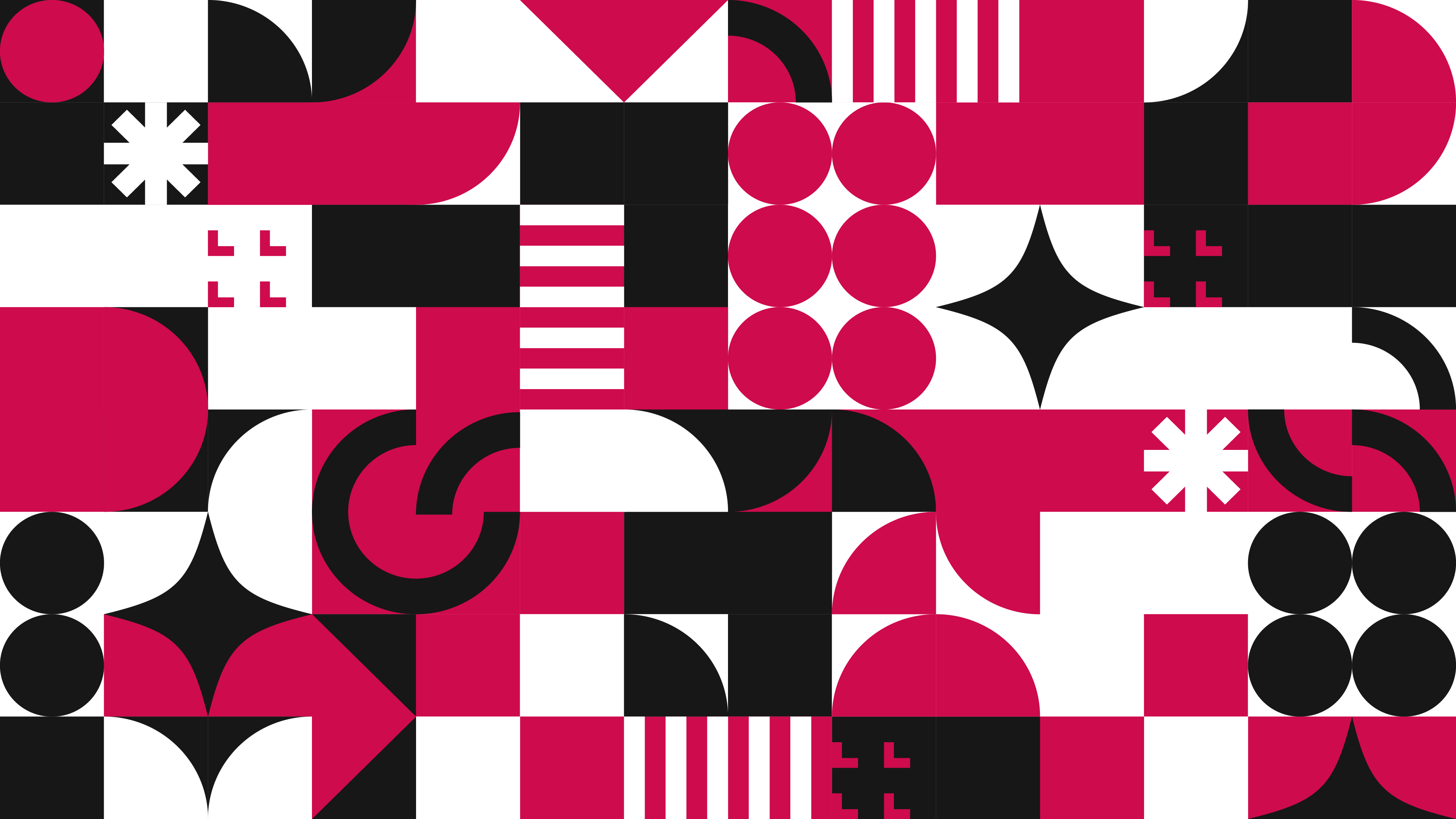
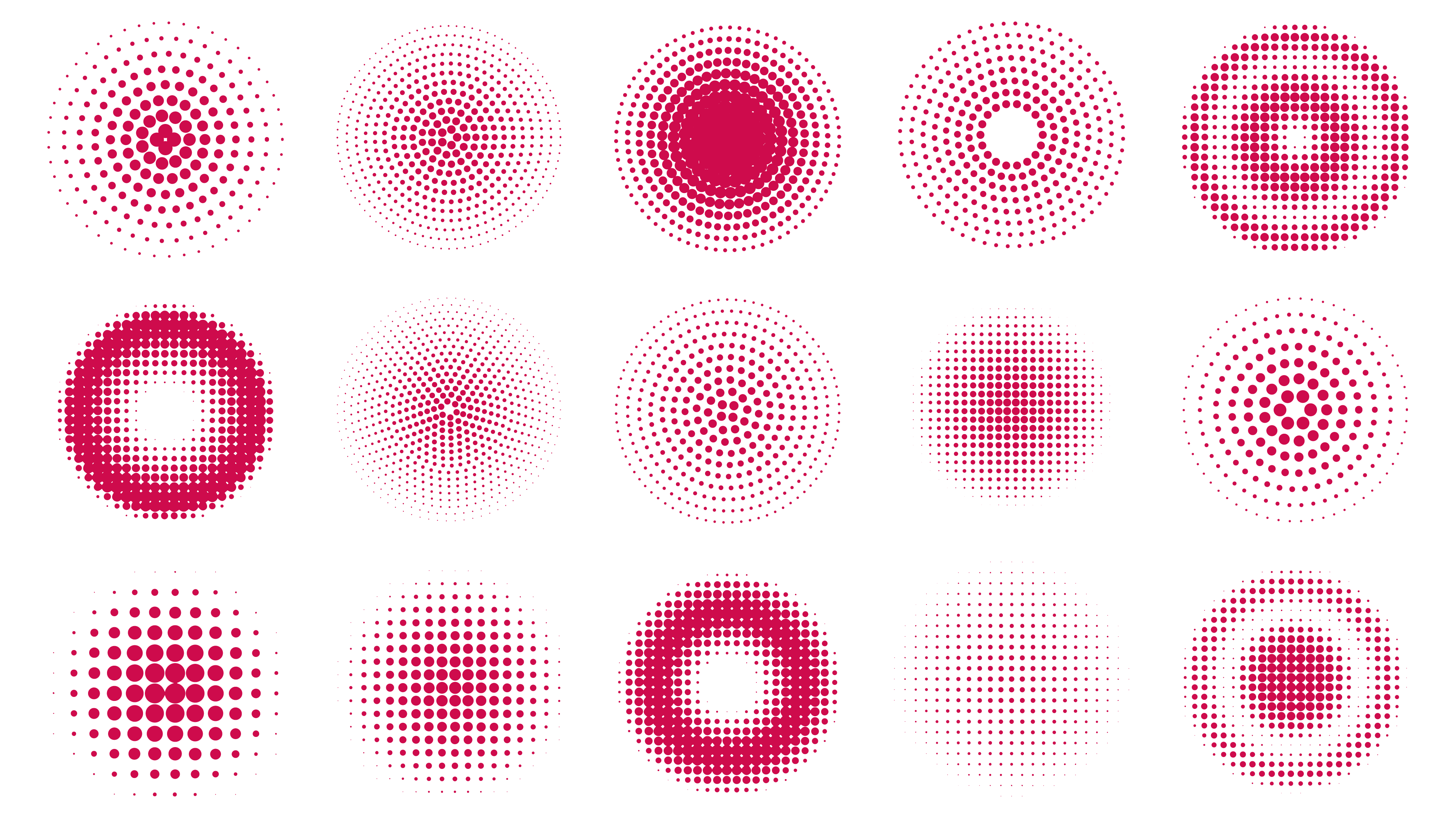
Download the approved Enviropop graphic assets for use across digital, print, social, and branded materials. This library includes patterns, textures, graphic elements, and other supporting visuals that bring the Enviropop identity to life.
Download Assets
Visual Assets
Our visual assets provide a library of approved graphic elements that reinforce the Enviropop brand. From bold shapes and playful patterns to supporting textures and graphic accents, these assets work together to create a consistent, energetic, and recognizable visual language across every touchpoint.
Bauhaus Tile Pattern
Approved Shapes
Approved Halftone Circles
Graphic Assets
Visual Assets
Our visual assets provide a library of approved graphic elements that reinforce the Enviropop brand. From bold shapes and playful patterns to supporting textures and graphic accents, these assets work together to create a consistent, energetic, and recognizable visual language across every touchpoint.
Image
Closeout Box
Image
Brochure
Image
Social Media
Image
Company T-shirt